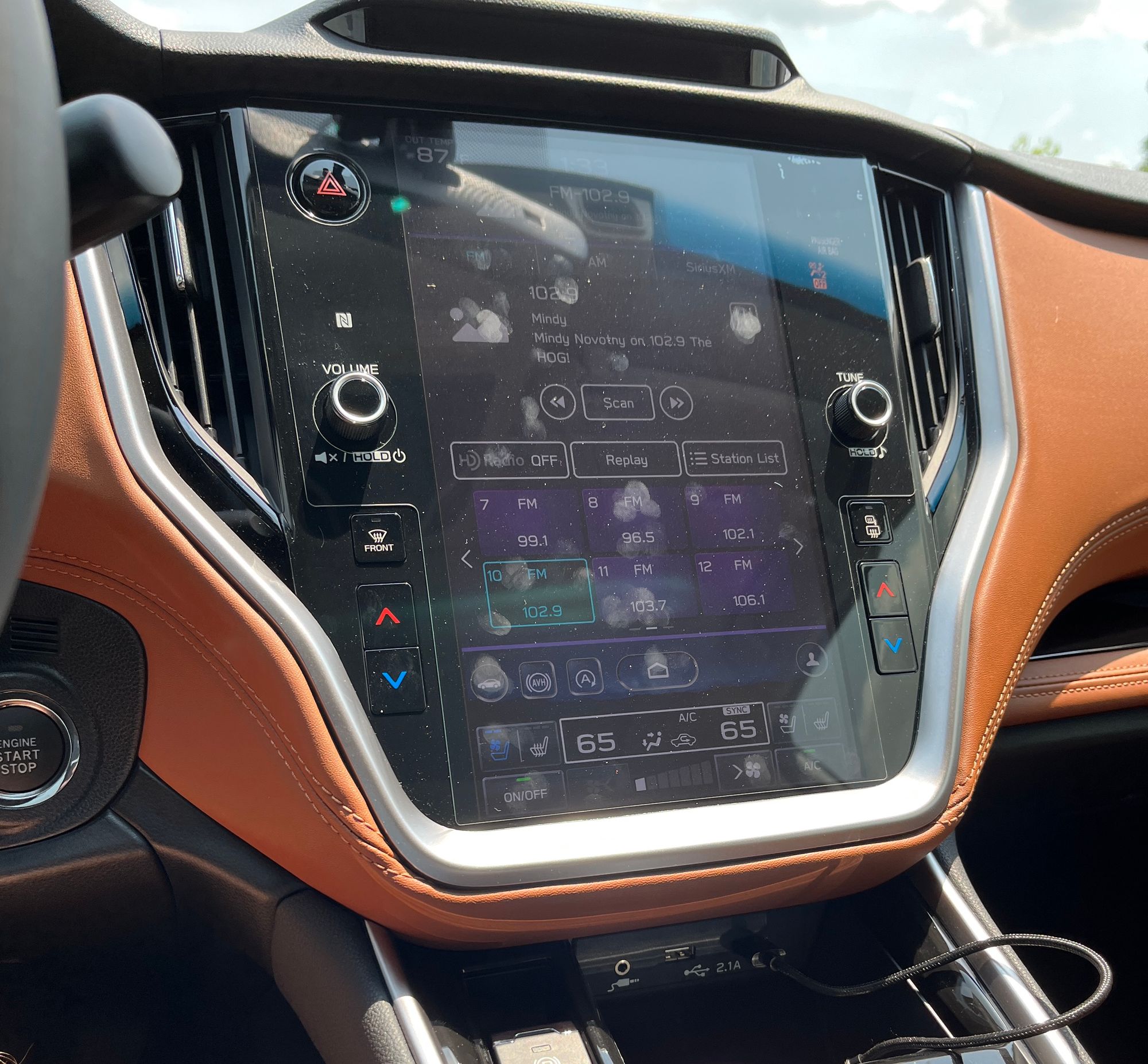
It’s been almost a year and a half since I picked up my 2022 Legacy XT. And, while I plan to do a separate long-term review in the near future, I’ve already come to at least one conclusion:
The infotainment is absolutely atrocious.
There are three main reasons that I think make it so terrible, which I’ll cover in detail below, in addition to offering some suggestions for how Subaru could address these issues and improve things.
But before I begin ranting, I want to be clear: This is not a criticism of Subaru overall. I love Subarus, having personally owned a number of them over the last decade - from my WRX to our Outback and now the Legacy. I’ve spent years praising them on this very blog!
In fact, it’s my fondness for the brand that caused me to write this post - I know Subaru can and should do better.
With that out of the way, let’s dig into why I think the infotainment in my Legacy is so awful.
Complaint #1: It’s Slow
I’m far from an expert in User Experience (UX), nor do I know much of anything about designing car infotainment, specifically.
But after over a decade of of developing websites professionally, I’ve come to appreciate a few things about what makes good software…well, good!
Two of the most basic ways are predictability and speed: Your software should do what your users expect, and it should do it relatively quickly. Basically, well-designed software should be fast, consistently.
The Subaru infotainment is none of these things. The screen is egregiously laggy, often taking literal seconds to respond.
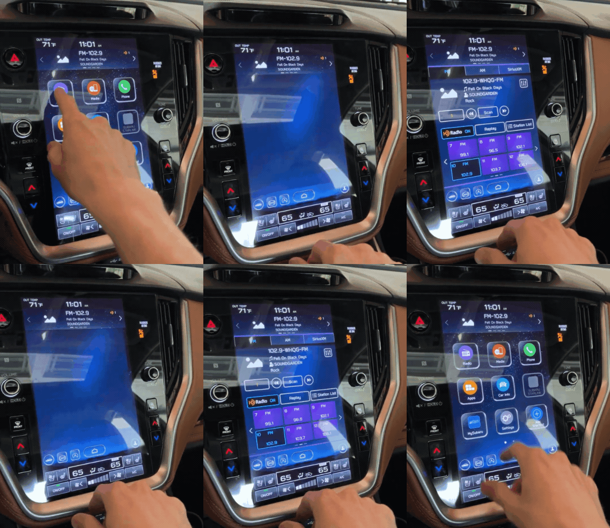
Touch the screen, nothing happens. Touch again, thinking maybe you didn’t hit the right spot. Nothing. Touch again.
Finally, the system catches up and registers all those touches at once, throwing up screens like you just clicked the “YOU’RE A WINNER” button in a spam email.
It feels like it’s 2008, and I’m using my very first touchscreen phone again (RIP LG Glimmer), but not in a nostalgic, fuzzy-feeling kind of way. It’s 2023, and we’ve come to expect a lot more from touchscreens.
This slowness creates a lot of unnecessary stress. For example, something as simple as getting in the car and trying to turn on the A/C or adjust the heated seats can be a huge headache. And with a dog and/or baby in tow these days, I just don’t have the patience for it.
Complaint #2: Touchscreens In Cars Are a Bad Idea
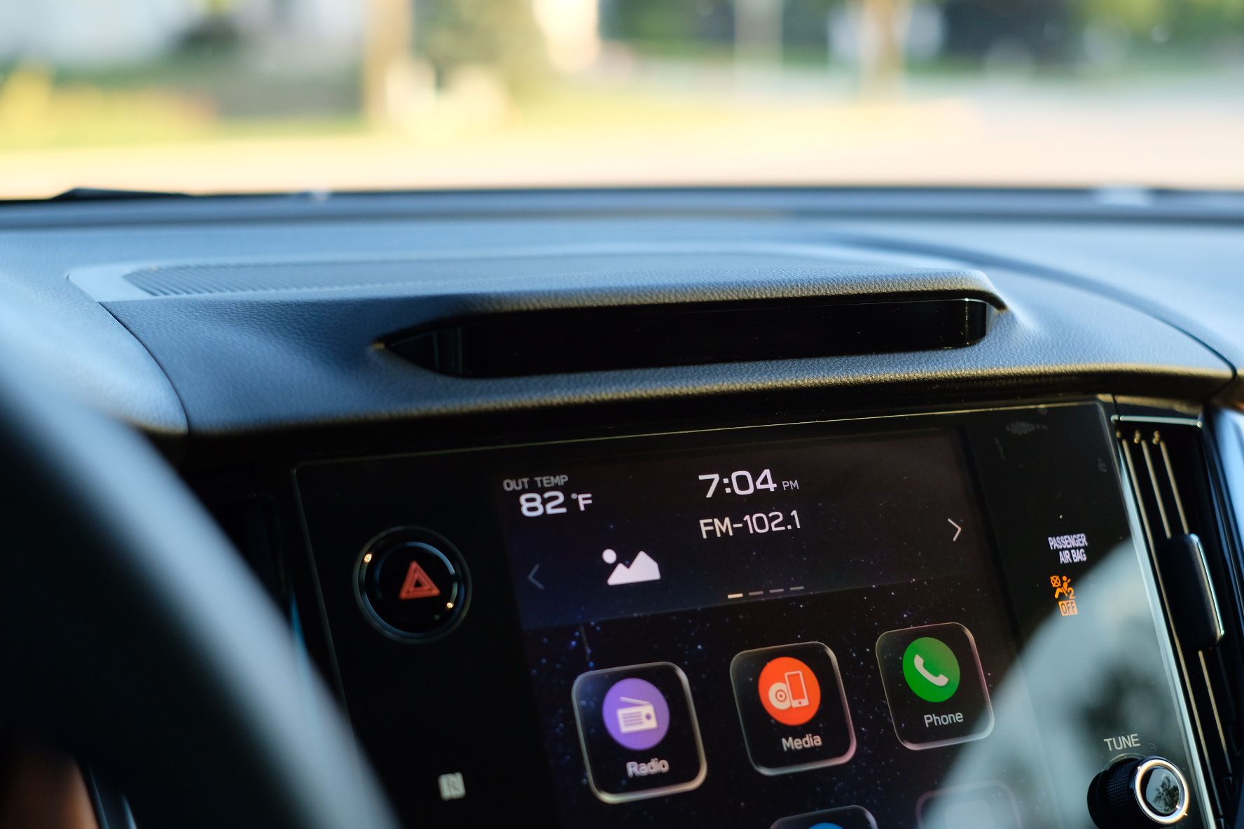
Look, I know Tesla did it first, but it’s just not necessary to have everything in the car controlled behind a single giant touchscreen!
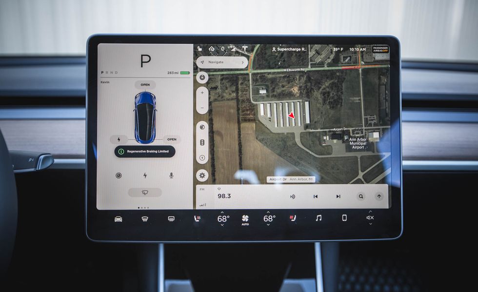
Granted, the upside is how big things like maps and music can be displayed. I love how the UI takes advantage of the available space; especially how CarPlay is displayed almost full screen. But I also desperately miss the physical climate controls from my WRX.
Years of muscle memory meant I could hop in and set the temperature without ever once glancing at a screen. This just isn’t possible in the Legacy.
Instead, since every menu and page can be laid out differently, it’s impossible to know what button is where without actually looking for it. Interestingly, Subaru seems to have realized this and dedicates a section of the screen for climate control shortcuts.
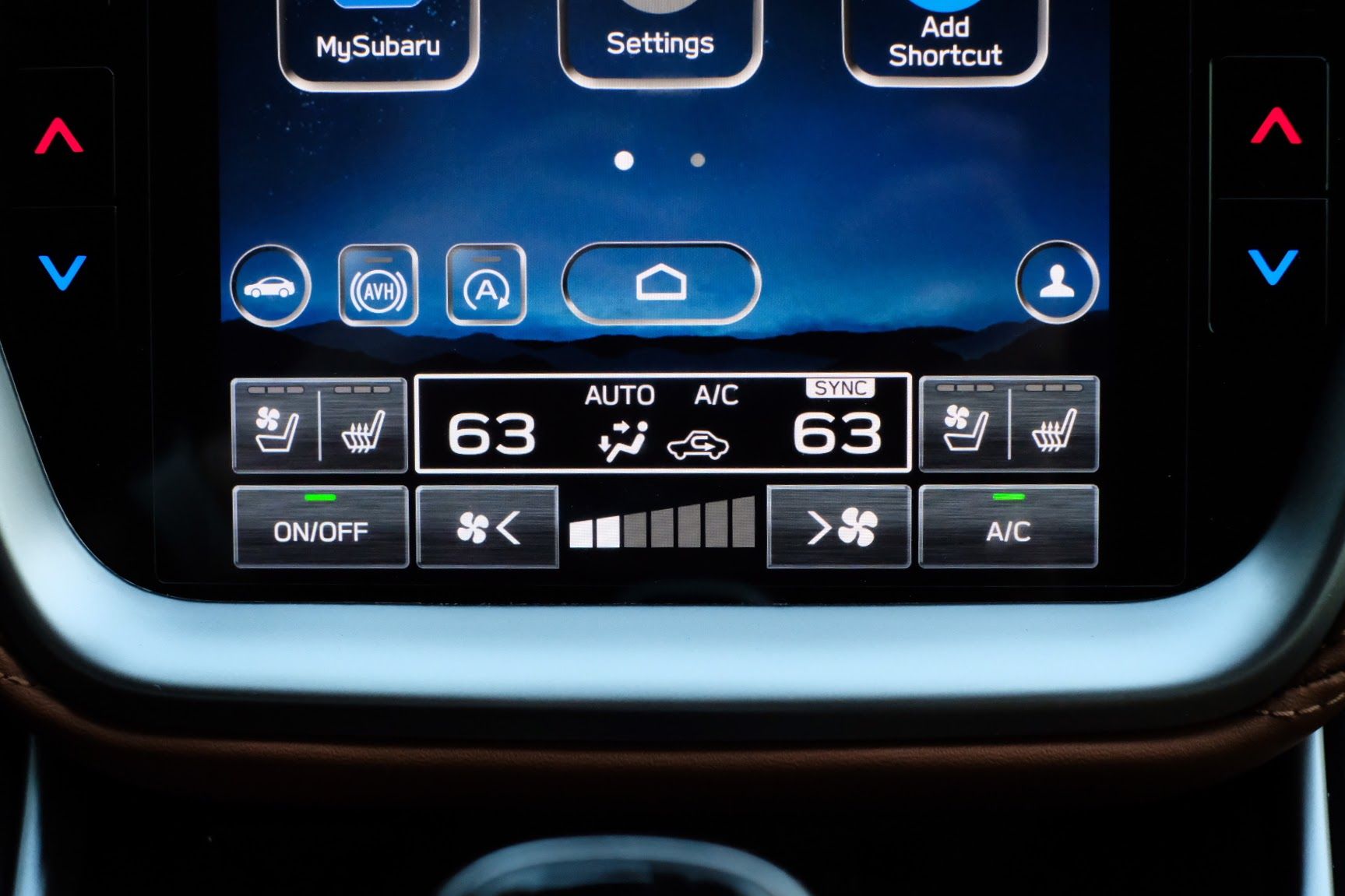
Unfortunately, in order to adjust more advanced settings like the direction of the air or recirculate settings (which, if you live in a four seasons area like the Midwest, you’re doing A LOT) you have to:
- Look at the screen
- Find the right button to click
- Wait 1—2 seconds for it to respond
- Look at the screen again
- Find the right button to click
- Etc.
To make matters worse, the display itself is difficult to see in during the day. The angle and size of the screen makes it a glare and reflection magnet.
And I know what you’re thinking: So just wear sunglasses during the day, dummy! Well, as it turns out, wearing sunglasses actually creates the opposite problem.
When viewed through polarized lenses from the driver’s seat, a good chunk of the bottom of the screen is darkened so heavily that it’s almost impossible to read.
Further frustrating things, the bright silver trim around the screen turns near-white in direct sunlight, which creates massive contrast issues and makes the aforementioned glare and shadows even worse.
This all means that, as the driver, you’re spending a lot of time with your eyes off of the road, tilting your head like a pigeon and trying to find the perfect angle to actually read the screen.
Which brings me to my third and final complaint about the infotainment in the Legacy…
Complaint #3: It Contradicts the Safety Systems
Subaru added a bunch of new features for the 2020 model year, most controversial of which was the introduction of the DriverFocus Distraction Mitigation System (what a mouthful!).
According to Subaru:
The DriverFocus system is like having an attentive co-pilot along for the ride, available to give a helpful alert if a driver becomes distracted or drowsy.
The system consists of a set of infrared cameras that constantly scan the driver’s face and eye position like something out of Terminator.
If the vehicle is moving, and it thinks that the driver’s eyes aren’t on the road, it will chime and flash a warning message on the dashboard.
In theory, this is a good idea. Systems like this could help lazy or inattentive drivers stay focused on the road, and prevent accidents from things like texting or rubbernecking your neighbor’s questionable lawn decor.
But what if you need to adjust the climate control because your 10-month-old daughter is screaming at you from the backseat? Well, since those functions are buried in a touchscreen, you’re forced to take your eyes off the road to do so.
See where I’m going with this?
Also frustrating is that the DriverFocus system is hit-or-miss in terms of being able to reliably detect your face at all due to sunlight, wearing sunglasses, or people with big noses (I kid), so it’s constantly deactivating itself. And when it is active, it can be a huge nuisance; causing more distractions than it prevents due to the incessant chimes and warning messages.
Thankfully, the system is fairly easy to disable and doesn’t active itself every time you start the car. However, if you’re like me and have other things disabled (like rear automatic braking or the tire pressure sensors), you end up with a nice little collection of permanent warning lights on the dashboard.
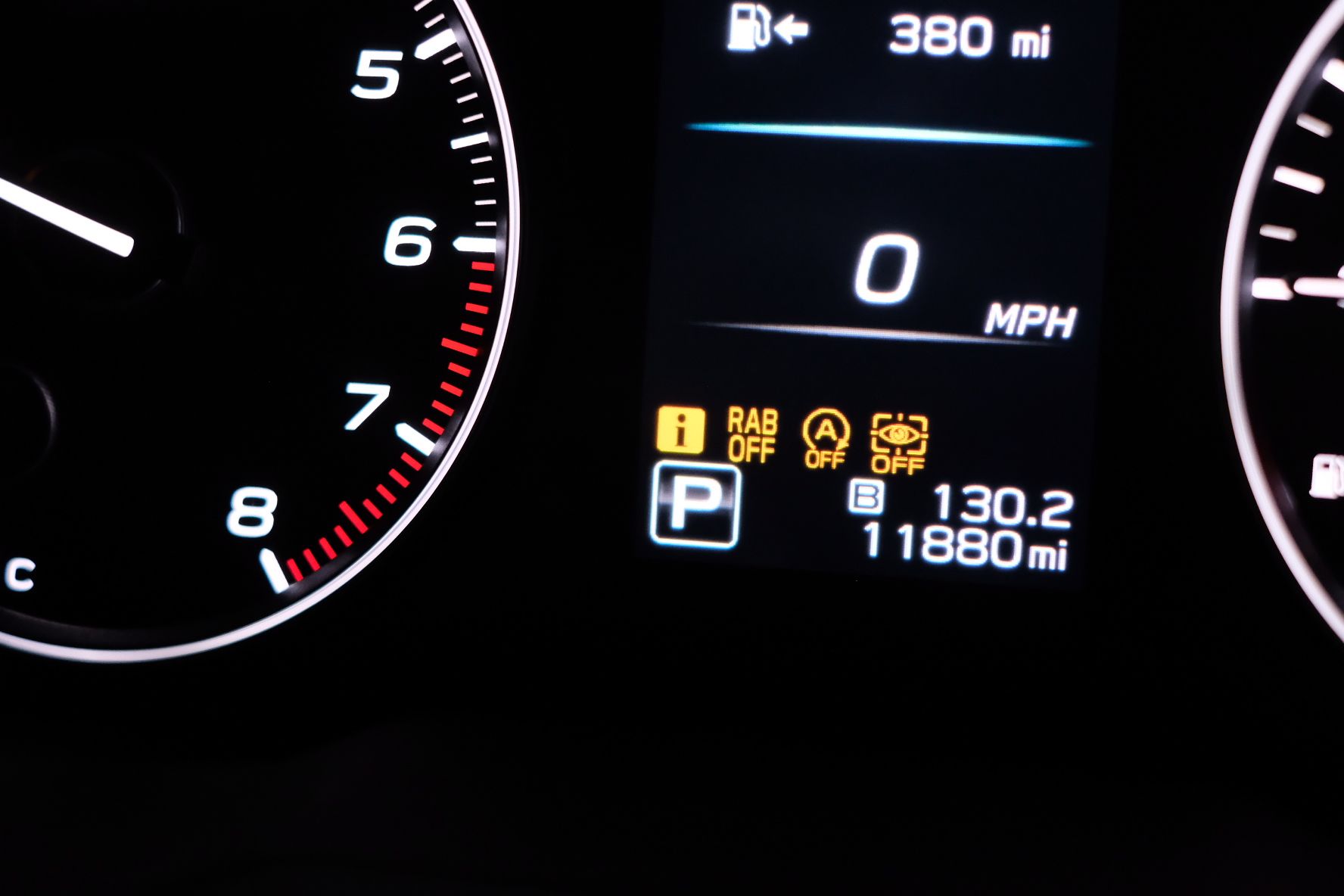
Generally, I don’t mind the DriverFocus system and I appreciate what Subaru is trying to do. Their obsession with safety is a big reason why I love the brand! But it sure seems like the safety and infotainment teams at Subaru were working on two different planets…
In what world does it make sense to have a big touchscreen combined with a face-scanning system that expects you to keep your eyes on the road at all times?
Room for Improvement
I’ve done a lot of criticizing the Legacy’s infotainment, but I also want to offer some suggestions for how Subaru could improve things.
Per my complaints above, there’s really three main areas that need addressing:
- Overall speed of the system
- Dependency on the touchscreen for essential functions
- Conflicts with the safety systems
Frankly, simply addressing the speed and/or dependency issues would go a long way to mitigating the third issue regarding the safety systems.
Perhaps faster processors and/or more RAM would give the interface a much-needed boost in responsiveness? This would mean less time spent looking at the screen and consequently less nagging from the DriverFocus system.
In addition, reverting essential climate controls back to physical buttons would reduce the need for extended glances at the screen, and allow for quicker adjustments.
The design and user interface of the system could be improved too. The last update did a great job of making certain buttons larger and easier to hit, but there are still areas where it feels like aesthetics were prioritized over usability. A few more tweaks and a simpler, more consistent UI (please get rid of the Windows XP-style graphics) would make for a much better overall experience.
Lastly, addressing readability of the screen could be as simple as adding an anti-glare coating or adjusting the color or position of the dashboard trim to reduce the reflections. Brightness and viewing angles of the screen itself could be boosted with a higher-quality panel, too!
Conclusion
As I stated at the beginning of this post, I love Subarus. And it’s frankly hard to admit that they really dropped the ball with this latest generation of infotainment. In spite of a few software updates, there’s still a lot of work to do.
And I know I’m not alone. There are a lot of unhappy owners also very vocal online, and a friend of mine actually just traded her Outback solely because she couldn’t stand it any longer.
Personally, I don’t think it’s so bad that I’d consider selling the Legacy (yet) - being able to use CarPlay for 90% of my needs makes the rest of it tolerable. But it does give me pause when thinking about whether a new Ascent, which is equipped with the same infotainment, would be a good fit for our family when it comes time to upgrade my wife’s car.
I really hope this kind of candid criticism can motivate Subaru (and other brands) to think more critically about the design of their cars, especially when it comes to something as important as the infotainment system.
If you’ve got a newer Subaru, are you frustrated too? Shoot me an email or hit me up on Instagram/Mastodon - I’d love to hear your thoughts!
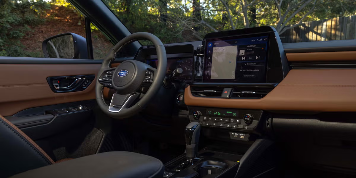
Update - January 2025: Subaru listened! The 2026 Outback was just revealed with a (likely) Toyota-sourced infotainment system and [GASP] physical climate controls! 😱
Subscribe For More Like This!
Enjoying this post? Get added to the mailing list and I'll let you know whenever I post new content!
Support
If you enjoyed this post, please consider supporting the blog by buying me a virtual coffee!
As a Software Engineer by day and dad by night, this blog is maintained in my free time. Your support is greatly appreciated and helps keep this site 100% ad-free!

